Using Child Themes
Customize P4 using a child theme
Please talk to the P4 Team before doing custom development and theming. If we are ever going to reach the full potential of Greenpeace’s engagement platform it is absolutely essential that we work TOGETHER.
Settings & Styles (theme.json)
In order to follow WordPress guidelines and simplify our code, we are moving a lot of styling options to the theme.json file. If you want to override and/or add some of these settings for your site, you can create your own theme.json file with your customisations in the root folder of your child theme. For implementation help, or just to understand better how this works, here are some useful links:
WordPress' relevant documentation, including the schema for the file
Full site editing course for developers
CSS
All css changes should happen inside style.css that lies on the root of the child theme and initially is empty. This css code is loaded after the master-theme’s css, so anything put in there will override the corresponding class or element.
Keep in mind though, that in the master-theme many elements and classes are nested (using Sass). For that reason we have to be careful with precedence and take that fact into account when we write our css code for our custom child theme. The more specific and explicit a css declaration is, the bigger precedence it has.
So for instance, if we want to adjust the color of the post tags, we should add a css rule like this one:
Templates
If we want to override an existing template the first step is to create a new folder named templates inside the root of our custom child theme.
Inside that folder, we create a twig template with the same name it has on the master-theme. The best approach would be to actually copy it from the master-theme so we can have its original code as a base for modifications.
So for instance, If we want to adjust the default page template we have to copy the one from the master-theme that exists at templates/page.twig and at the moment contains this code:
Assuming we want to display more metadata to the pages content, we would have to use the same code and do any additions (or deletions) we want.
Live Examples
Below are examples of customizations made by various offices which use Planet 4. For more advanced topics or specific tweaks, you can refer to the customized child-theme code from any of office running Planet 4 (which you can find in Github via this search).
Change default font
For the needs of the Greek website or the Thai website we needed to change the Lora serif font, that is used in the master-theme, to a Sans option. Noto Sans is the font we use for body copy if a language doesn’t support serif font. In order to avoid overriding every present or future occurrence of the Lora font, instead we used the same font-family name to load the new font. So every class or element that uses Lora will automatically use the new one.
As an example, here is a snippet of code that sets the Greek letterspace for normal font-face:
The full code of the Greek website customizations can be seen at the planet4-child-theme-greece repository.
Change navigation bar colour
Many NROs have decided to change their primary navigation toolbar, below a full list and some screenshots:
GP Netherlands opted for a full white nav bar.
Create a navigation sidebar
For the needs of this awesome Handbook website we needed to add a sidebar and move the navigation links to that. In order to achieve that we created two new templates in the child theme. One for the top navigation bar and one for the sidebar. Following master theme naming scheme, the first one is navigation-bar.twig, where we removed the code that generates the navigation links and left only the logo and the search form. The second one is the sidebar.twig where we added the code for generating the navigation menu and through custom css code we style it to be vertical.
Full code for this example can be found at the planet4-child-theme-handbook repository.
Moving NRO switcher to the bottom of the page
If you need more space in the top bar navigation (for instance you have a multilingual site and need a language switcher at the top), you might need to move the GPI NRO selector from the top bar to the bottom of the page like on GPLux website.
To move the selector you need to:
create in your child theme directory an empty directory called "templates" symmetrical to the templates directory of the P4 master theme (here)
copy the navigation bar template from the original theme.
modify the template by deleting the following blocks.
copy the footer template from the main theme.
add the country selector to the footer where you want to print it for example below the footer-links-secondary.
then apply the css.
If you want to change the little arrow which opens the selector, you can rewrite the “after” element with an image from your theme directory.
Split css code
Since our css code on child themes is located in just one file it can easily start getting difficult to maintain as it grows in size. To avoid that, we can create a new folder and break up our css code to blocks that make sense. Then we can just import them to the main style.css.
As an example, you can see the greece child theme.
Using css variables
To make some of the custom css code more maintainable we can use css variables. Especially for the things that are re-used in many places inside our code. Our theme colors are a good example for that.
As an example, you can see the handbook child theme.
Using underline titles effect
Luxembourg child theme implements a short css section to underline titles with a green gradient line. We had an unexpected good feedback on this effect thus we share the code here:
If you don’t use postcss prefix you can use this code:
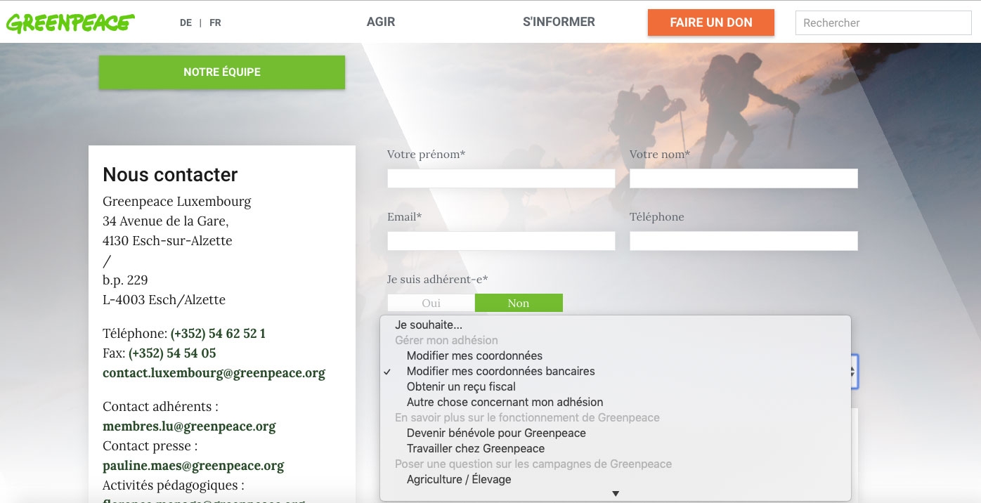
Building a contact form
You will find on GP Luxembourg a custom contact form. On this form, changing the input Objet de votre message will open many different use cases for the user (like changing his bank account). An e-mail is sent to the admin on submit.
If you want to reproduce this form you can simply grab the code here:
The frontend code.
and the js code which handles all forms actions, field filtering and event triggered.
on server side, the code is in the function.php file the
gpf_form_submitfunction.and optionally the css. (please note scss is compiled with a webpack script to minified scripts and scss in the /dist folder)
Adding scripts
Form validation, masking, animation, 3rd party popups. See Aotearoa child theme for examples / source code.
Enhanced Donate button on mobile
This will show Donate button fixed on top of screen on mobile devices
Last updated